This ’90s L.A. Home Got a Major Glow Up With Fluted Wood and Arches
The staircase’s elevated refresh hinges on this small change.
Updated Oct 12, 2018 2:05 PM
We may earn revenue from the products available on this page and participate in affiliate programs.
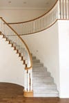
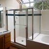
Putting it nicely, “it was the American version of what Mediterranean looks like,” Natalie Myers, principal designer for Veneer Designs, recalls of stepping inside her latest clients’ home in Los Angeles’s Ladera Heights. The space had all the dead giveaways of 1990s construction: chrome-framed skylights in the bathroom, a slightly curved staircase plopped in the middle of an open foyer, plasticky gray kitchen floor tiles that are meant to look like stone. “Think: builder-basic,” she says. “It was not their dream home by any stretch of the imagination.”
The homeowners, a couple with four children, were moving into the neighborhood from a small rental in nearby Culver City and envisioned hints of Scandinavian and Australian minimalism in the form of blond wide–plank flooring, fluted wood detailing, and matte white lighting. Myers committed to the Nordic-inspired vision, though not completely ditching the aesthetic the original builders got wrong the first time around. “Let’s lean into that Mediterranean vibe a little bit,” she told her clients. “Because otherwise there’s not much architectural interest.” Here’s how she took the sad ’90s space into the 21st century.
Supersize the Arches
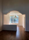
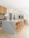
The house already had a partial archway between the living and dining rooms working to its benefit. But Myers notes it was “strangely articulated” (the one side formed into a half wall and the top of the structure wasn’t a smooth curve). So she opened the whole thing up and made the threshold extra-big (luckily the room already had a 10-foot-high ceiling, meaning there was more flexibility). Then she added a second one on the other side of the dining room that leads into the kitchen. “It creates this compelling corner where all three rooms connect,” she says.
Streamline the Stairs
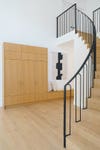
It would have cost up to $20,000 to restructure the stairs, so the designer stuck with a cosmetic update. Cue Stuga flooring to the rescue. In addition to using the European-manufactured engineered boards throughout the home, Myers bought the premade nosing (the part where the tread meets the riser). “A lot of the time you have to have the strip made separately from the flooring,” she notes. The company’s design also sits flush, giving it a super-contemporary look. “It’s a small detail, but I really appreciate it,” she adds. The custom iron railings were bent on-site into elongated archway cutouts.
Rethink the Pantry Location
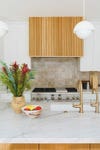
As beautiful as the kitchen is now, it’s not all that big (the one main wall where the range is is also for the cabinets), so Myers shifted the pantry into the hallway (but you’d never know there were snacks behind those wood doors). The system works out for everyone in the family: The parents get to have their favorite pans on hand in the kitchen cupboards, while all four of their little ones can grab snacks while not getting in the way. “It’s off the garage, so you can put your stuff down or put on your shoes before going out,” she says.
Repeat Subtle Statement Moments
Because they ended up doing a predominantly white kitchen, Myers needed something that added character and texture. Flexible tambour wood spruced up the range hood instantly, plus the sheets are easy to install (it’s not dowel by dowel). She put scraps to use on the legs of the dining table and a TV feature wall in the adjacent media room. “If you only do it in one spot of the house, it feels pretty random, so you have to spread it out,” she says.
Do an Accent Wall in Tile
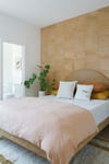
The guest area was a white box of a room, so since the homeowners craved more tile anyway, Myers opted for an accent wall clad in terracotta squares from Zia Tile. “When guests come over, they know it’s just going to be a good time. It’s like a wild adventure; you feel as if you’re on vacation,” she says. It’s a nice change from paint or wallpaper.
Dive Into Spa Mode
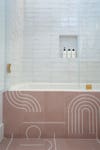
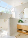
Myers scrapped the two individual vanities in the main bathroom and turned them into one unit. Then she swapped the shower and tub placement to optimize the layout and ensure the most frequented spot was bathed in natural light to really achieve that zen feel. By switching the horizontal tiles into a vertical format on the wall, the room appears larger than it really is. “It keeps your eye moving,” she notes. A few more arches in the form of mirrors bring this home’s renovation full circle.


