This Bathroom Vanity Design Will Clear the Clutter Off Your Countertop for Good
It even hides your toothbrush holder.
Updated Oct 3, 2018 9:25 PM
We may earn revenue from the products available on this page and participate in affiliate programs.
No matter how neatly you line up your bottles of face oils, toners, and night creams, bathroom products always find a way to look a bit cluttered when left out in the open on the vanity countertop. That’s why designer Evgenia Merson went searching for a solution while recently renovating a San Mateo, California–based client’s space. Her fix? Build two storage “towers” in each corner, flanking the new mirror. “They’re perfect for everyday items,” says Merson. The extra-tall cabinets extend all the way to the ceiling, which maximizes the opportunity for storage, since the nooks aren’t superdeep. The designer even added outlets inside of the white oak wood structures so the homeowner can put her electric toothbrush inside—and, most important, out of sight.
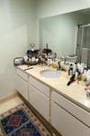
The rest of the windowless, 60-square-foot room was also in major need of an update. Ahead, Merson walks us through the style-focused transformation.
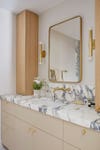
While Merson didn’t alter the layout of the bathroom much, she did make one serious plumbing change: She mounted the sink faucet on the wall. This swap allows the new marble countertop to be the sole focus. The beaded doors play another visual trick by continuing the vertical lines of the tall upper cabinets, thus making the room’s ceiling appear taller than it really is. “We definitely splurged on the custom cabinets and plumbing fixtures,” notes the designer.
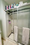
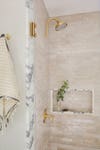
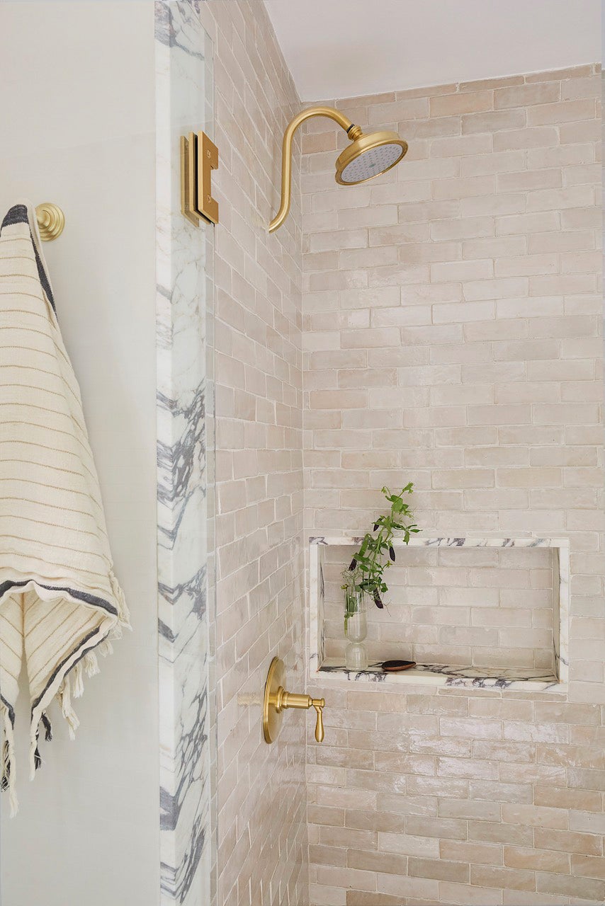
The existing plasticky white shower with its metal-lined sliding door was the kind of setup you could just buy at Home Depot and install in a day. “It was like a premade piece,” recalls Merson. She demolished the dingy shower and covered the walls in sandy-toned zellige tiles instead. She used the offcut pieces from the vanity countertop and turned them into trim for the shower (she also put the scraps to use around the shelving niche). The slivers of stone make the space look luxe, but they also made installing the shower tiles easier.
“Zellige is really thick and comes with unfinished edges, so it’s always a challenge [to figure out] how you are going to finish off the corners,” she explains. This was an easy way to get a clean line and create a more elevated look in the same go. “Using the stone slab in multiple spaces helped us stay cost-efficient, too,” she adds.
The designer kept the marble theme going on the floor with herringbone-pattern marble tiles. It took trying out five different samples to find slabs that were long enough (she didn’t want the arrangement to look mosaic-like) and had visible veining (so you could tell right away that it’s real stone). Psst: Merson landed on 1-by-4-inch Carrara tiles from Stone Center. When you only have 60 square feet to work with, every detail counts.
