What Looks Like Wallpaper in This Bathroom Is Actually Tile
One humble material, three creative ways.
Updated Oct 11, 2018 11:15 PM
We may earn revenue from the products available on this page and participate in affiliate programs.
Dina Bandman doesn’t always have free rein in her interior design projects, so when she gets carte blanche—as she did for her room in the recent San Francisco Decorator Showcase—she takes the opportunity to go bold “It’s the perfect place to let your creativity run free,” she says of her latest endeavor.
The only brief she was given: to imagine a kids’ bathroom to share. “I wanted to create a joyful space for children that would be memorable, delightful, and just overall happy,” she explains. Her anchor color of choice: a cheerful cherry red. Here’s how she finished the rest of the space with not one but three clever uses of tile.
The Mosaic That Started It All
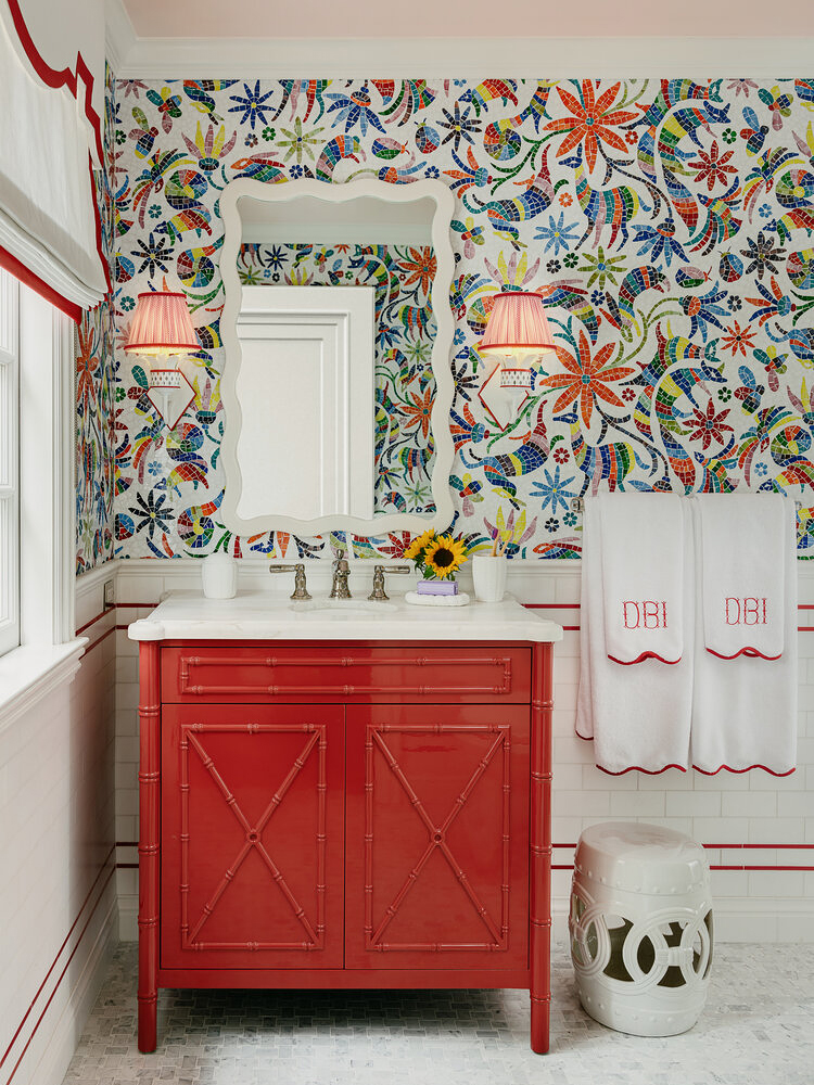
At a glance, Bandman’s bathroom looks like it’s covered in wallpaper, but it’s actually a New Ravenna mosaic tile, which served as the jumping-off point for the space (hence the room’s nickname, No Drama Llama). “I fell in love with it the moment I discovered it and have been looking for a place to use it ever since,” says the designer. The pattern is inspired by the artwork of the Otomi people in central Mexico. “Their designs are filled with symbols of native flora and fauna, and you see this represented in the foxes and llamas prancing throughout the mosaic,” she notes.
The Subtle Border
Because the upper half of the wall is quite dominant, Bandman knew whatever she paired it with needed to be something simple that wouldn’t compete. White subway tile did the trick, but the designer couldn’t just leave it plain. Instead, she ran a double ticking stripe at two different heights and carried the detail onto the window shade, the sconces, and the monogrammed towels.
The Right Frame
Bandman brought the graphic red accent into the shower stall, this time crafting a framed border on the two walls in the enclosed space. “It creates a cohesive design throughout the room,” she says. To offset the bold use of wall tile, she kept the floors in a simple marble hex design and painted the ceiling a barely there blush. “The light pink is a subtle detail that’s not too overpowering. Sometimes you just have to know when to use restraint,” she adds.
Our Fall Style issue has arrived! Subscribe now to get an exclusive first look at Ayesha Curry’s Bay Area home—and discover how design can shape our world.
