Step Inside the Jewel-Toned New York Home of Our Dreams
Here's how it inspired our favorite new prints.
Published Aug 20, 2018 5:26 PM
We may earn revenue from the products available on this page and participate in affiliate programs.
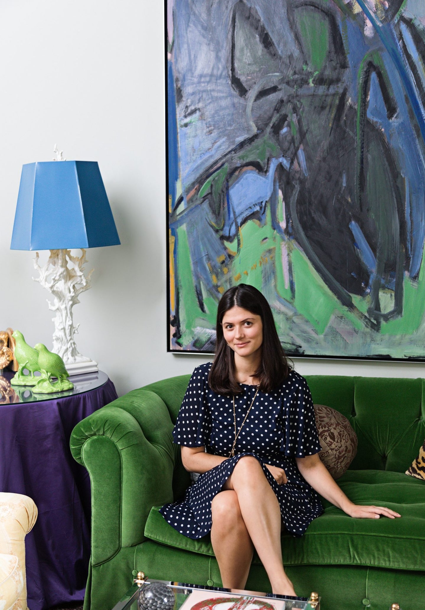
For Edith Young, getting “younger people interested in very old things” is a calling of sorts. The Rhode Island School of Design alumna and New York-based multi-hyphenate (photographer-designer-writer, for now) has lent her talents to the millennial trifecta of female-led brands—Glossier, Outdoor Voices, and, most recently, Man Repeller—as photo editor and in-house photographer. She credits the entrepreneurial influence of those companies’ founders as an essential component in launching her own startup endeavor: making art history cool via painterly Pantone prints.
[noads]
A humorously enticing research prompt (“The best red is to copy the color of a child’s cap in any Renaissance portrait”) derived from a quotation by fashion icon Diana Vreeland led Young to begin cataloging distinctive crimson hues over the course of two years. A school project provided the impetus to distill her color bank into her first print: a four-by-five grid studiously annotated with the title of each historical artwork.
[/noads]
After being inundated with Instagram requests, Young decided to put a suite of the palettes into production. Having moved back into her parents’ Manhattan apartment following graduation, she scrappily fulfilled the first 200 orders out of her bedroom—a former master closet converted by her mother, interior designer Stefanie Scheer Young.
Young’s creative trajectory and cultural fluency can be attributed in part to her art-loving parents, who would often bring her on trips to auction houses, antiques fairs, and museums. For their home’s audacious hues, Scheer Young toured exhibitions at the Metropolitan Museum of Art, analyzing how the curators employed “richer, more complex colors.”
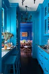
Other unexpected inspirations include a handful of peacock feathers that helped determine just the right pairing of blues in the dining room and bar area. “After testing dozens of paint samples, we had confirmation from nature that it wasn’t crazy to have them together,” quips Scheer Young.
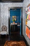
The splashy yet considered palette continues throughout the rest of the apartment, from emerald and amethyst tones popping against a softer gray-green in the living room to solid black setting the stage in the powder room for a striking, three-dimensional canvas by George Ortman.
The family’s penchant for collecting unique mementos creates more artful and witty combinations throughout the home. While conspicuously free of color, the kitchen’s all-white surfaces put the focus on an extensive set of heirloom Royal Copenhagen dishware—as well as a photo from Young’s Pie Eating Contest series (now available as a Man Repeller collaboration with Framebridge).
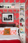
And the scarlet-hued zebra wallpaper in Young’s bedroom? The diminutive square footage prompted her to take a risk with a Scalamandre pattern she fell for after seeing it in Wes Anderson’s The Royal Tenenbaums. A small but growing collection of black-and-white photography personalizes the space.
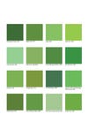
The cumulative effect of living in such a “stimulating environment” inevitably informs Young’s own work, which continues to be in high demand. In addition to the previously sold out Red Caps series, she is relaunching palettes this fall based on Audubon’s bird beaks (cheery yellows and berry reds), Fairfield Porter’s skies (melancholy, gray-tinted pastels), Tonya Harding’s figure skating costumes (electric jewel shades) and Wayne Thiebaud’s garnishes (shown below)—each as a print or T-shirt sold through her website.
Regardless of format, her mission remains the same. “I want to make art history accessible,” says the consummate creative. “Color is a tool for tackling more complex ideas in a way that’s positive and uplifting.”
This story originally appeared in the Fall 2018 issue with the headline “The Color Curator.”
