With a Good Layout in Place, This Kitchen Reno Was About Gaining More Counter Space
Clever moves made in inches, not feet.
Published Feb 17, 2024 4:25 AM
We may earn revenue from the products available on this page and participate in affiliate programs.
Near the center of San Francisco, the steep hills that surround Cole Valley are lined with colorful Victorian and Edwardian homes that have stood for generations. When two Midwestern transplants moved to the compact neighborhood a little over a decade ago, they fell in love with its many beautiful views, but it wasn’t until 2021 that they purchased a home in the area on an enviable perch.
Aside from a coat of paint and a newish stove, oven, and refrigerator, it was clear the previous owners hadn’t done much to spruce up the kitchen since the Summer of Love was still a fresh memory for the city (yes, we’re talking circa 1967). For designer Rachel Seldin, principal of Seldin Design Studios, the glaring issues were the room’s lack of charm, countertop space, and storage. “And the predominantly white and gray cabinetry blended in with nondescript, bulky appliances,” she points out.
The couple requested a space where the architectural details on the exterior of the home (and frankly throughout their neighborhood) were reflected in the interior, from push-button light switches to the antique brass hardware. Here’s how Seldin reimagined old-world features for a modern address.
Create an Even Better Layout by Making Tiny Moves
The owners didn’t have an issue with the existing layout of the kitchen. In fact, with the sink conveniently located next to the dishwasher, and the refrigerator and oven situated diagonally from one another, you can move about the space efficiently. And yet the appliances were all just a few inches from their ideal spots, cutting down on precious countertop space.
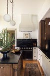
Seldin swapped the 30-inch-wide stove for a 36-inch version and centered it along the wall, allowing for around 18 inches of prep space on both sides. She also increased the size of the fridge-freezer to 42 inches and pushed it 12 inches to the left so it aligned with the end of the countertops on the opposite wall. The result? There’s a lot more room to chop veggies and roll dough.
Another benefit of keeping the appliances (mostly) in their familiar places was that the budget didn’t have to include any changes to the water and gas lines. Instead, Seldin could direct those funds to more fun features like solid brass cup pulls and custom roman shades in the dining nook.
Lower the Ceiling If the Right Hood Calls for It
When Seldin and her clients were first discussing the changes they wanted to make in the kitchen, they all agreed to shine a spotlight on the range hood. Prior to the renovation, it was integrated into the cabinetry on the half-wall near the doorframe, and the trio agreed that pulling it out and making it a feature in that corner would be more worthwhile. The only problem? The nearly 11-foot ceiling was so tall they’d need to add a soffit for additional support, which would result in a boxy look.
“We pivoted our approach, opting to lower the entire ceiling by a few inches,” Seldin says. A lower profile made it possible to have a stand-alone hood as a streamlined focal point, while also making the area feel cozier. The ceiling still feels so tall that the family barely notices a difference.
Add Historic Details in a Classic Palette
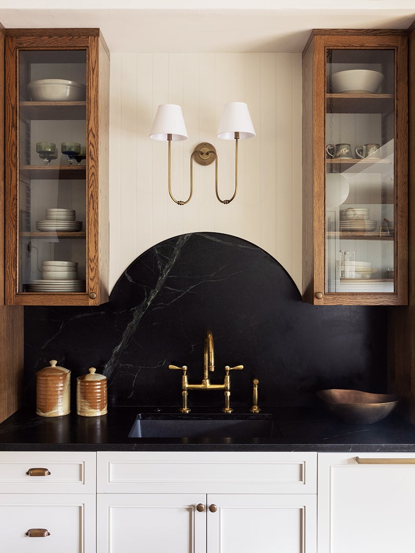
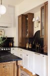
Seldin and the owners were on the same page when it came to the color palette, deciding that the kitchen’s long footprint didn’t exactly call for stark white cabinets, which could actually make the room feel cold and uninviting. Plus the goal was to bring the Victorian aesthetic indoors, so Seldin and the couple went with Stormy Black soapstone countertops alongside creamy white lower cabinets (painted in Strong White by Farrow & Ball) and dark wood upper storage that coordinates with the floors. Incorporating a handful of glass fronts lent an apothecary-like touch.
Even the backsplash’s swooping shape behind the sink provides a wink to history and a layer of texture. “The gracefully curved backsplash not only adds an element of elegance and uniqueness, but also harmonizes with the overall aesthetic,” says Seldin.
Incorporate the Breakfast Nook by Copying Curves
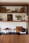
The breakfast nook had already been a part of the kitchen by the time Seldin was asked to refresh the room, but it seemed disjointed. “That area felt empty, despite having a table and four chairs,” she says. To make the nook feel a part of the kitchen, Seldin built a custom bookcase using the same wood stain, countertop stone, and brass detailing as she did throughout the rest of the kitchen.
Sadly, the designer couldn’t trick out the bench with hidden storage (it houses the baseboard heaters), but she did give it a half-moon silhouette, similar to the backsplash behind the sink. “It facilitates a smooth visual flow, ensuring that even if the table and chairs are removed, the nook could stand alone as a beautiful reading area,” she says. Although, let’s be real, when you’re sitting in that window, you’re looking out onto the hills, not down at a book.


