Narnia Who? This Cottage’s Attic Doors Reveal a Dramatic Marble Shower
It’s tucked perfectly under the pitch.
Published Mar 21, 2024 1:25 AM
We may earn revenue from the products available on this page and participate in affiliate programs.
When Jonny, a music producer, and Krystal, a floral designer, took a trip to Inness, a hotel in upstate New York, they took note of the ladder-back chairs surrounding the long communal dining table and the larder pantry painted a rich coat of ochre. This was the vibe they wanted to create in the 1860s cottage they recently purchased in nearby Rhinecliff. They tracked down Post Company, the design agency behind Innes, and asked if they would take on their historic property: It’s one of the oldest preserved houses in the area and measures a mere 1,250 square feet. Post Company accepted the challenge.
“[Innes] has a lot of restraint and a minimalist sensibility, but through a lens of warmth and intimacy. I think that’s what resonated with them,” says Leigh Salem, one of the partners at the design firm. The couple’s home was the definition of small but mighty. The expansive windows automatically made the interior feel bigger than it is, and there were nooks and crannies aplenty (read: storage opportunities). Krystal and Jonny never expressed interest in tacking on an addition, not even when it came to their primary bedroom in the attic. The bones of the house were perfect as is. It simply needed a luxury resort–inspired twist.
Build a Tempo With Color
There is a rhythm that pulls you through the house the moment you walk through the mudroom door and it goes: dark, light, dark, light. “There’s often an inclination with smaller houses that a lighter palette will be perceived as larger, but we were more interested in creating a language of thresholds between light and dark,” explains Salem.
The tricky part wasn’t choosing what paint colors to use, it was the fact that Jonny and Krystal were living in London while the renovation was going on. “Committing to an exterior house color without seeing it in person was daunting,” says Jonny. Fortunately, they had friends in the area who kindly visited at various times of the day and in different weather conditions to take pictures and videos.
The mudroom, now lined with closet doors that hide everything from overflow cookware to the washer and dryer, made the couple a little nervous the first time they saw photos of it. “It appeared more orange than anticipated, almost pumpkin orange,” recalls Jonny.
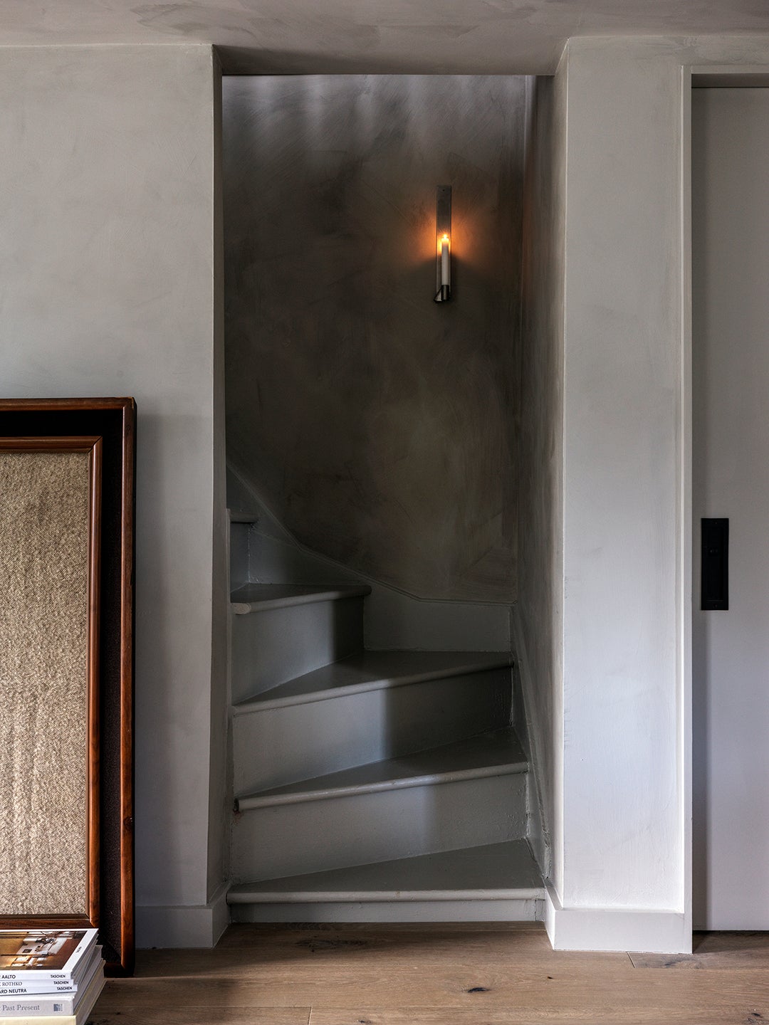
Post Company urged them to stick with the rusty red color (Benjamin Moore’s Tawny Rose), at least until they saw it in person. They agreed and eventually found the photos really didn’t do it justice. “Now it’s everyone’s favorite room because it provides a wonderful contrast,” adds Jonny. As you reach the end of the 4-foot-long hallway, you are introduced to the kitchen, swathed in Soapstone by Portola Paints. When you round the corner up the narrow staircase to the main bedroom, you’re greeted by a moody gray surprise.
Stress Awkward Spaces
Rather than try to open up the low ceilings in the attic bedroom, Post Company decided to call attention to them by covering every surface of the cavernous space in Portola’s textured Dry Ground limewash. “We’re not trying to fool anyone,” says Salem. The only visual trickery is the cabinets tucked within the pitch of the dormer: It’s the couple’s primary closet.
While Jonny traveled back to New York a few times toward the end of the reno, Krystal went six months without seeing the house. Their first night in the home was a bit of a blur (mostly due to jet lag, they admit), but they do remember one thing: lying in bed watching the snow falling outside. “It felt truly magical,” says Jonny.
Reach Peak Bathroom Goals
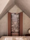
Previously, when Jonny and Krystal entered their bathroom, they’d find two small freestanding sinks to the right and left of the door and a tub-shower tucked in the corner. To achieve a more comfortable bathing experience, Post Company shifted the shower placement to the center of the room where the ceiling height is the tallest. Then they clad the whole thing in dramatic slabs of Calacatta Rosa marble, mimicking the same level of saturation in the mudroom downstairs.
The central shower placement also lets whoever is in there enjoy the views out of the bedroom window. “When you’re in a more private space, you don’t necessarily have to close your bathroom door,” Salem points out. Going with two small doors over one large swing one allows for some flexibility without totally blocking the path to the bed.
Not pictured? The bathroom’s moody lighting. There are two matching sconces over the new vanities on either side of the door, as well as a canned bulb that throws light down the center of the shower.
Push the Kitchen to the Walls
The main design challenge in the kitchen was making way for a proper dining table. Post Company swiftly nixed the peninsula that was bisecting the room and brought in a vintage Belgian table that can double as an island when there aren’t chairs around it.
They continued to elongate the space by adding a stretch of lower cabinets across the windows, which now fall in line with the new bleached white oak floorboards. They won back storage by cladding the wall that leads to the mudroom in floor-to-ceiling cupboards that disguise the pantry, refrigerator, and microwave.
Pick Overhead Lighting Wisely
Knowing that the petite cottage gets loads of natural light from the large windows (which Post Company simply replaced with efficient versions from Marvin, keeping the openings the same size), the need for overhead lighting was fairly minimal. “We don’t love using recessed lighting, especially in a compact house like this where materials are super-important,” says Salem. For any area that needed an overhead fixture (over the coffee table, above the kitchen sink), they brought in brass and oxidized brass spotlights from Long Made Co. and Roll & Hill that contribute to the home’s newfound patina.
