I Got a Color Analysis Done to Figure Out My Home’s Perfect Palette
Shopping will never be the same.
Published Mar 9, 2024 1:46 AM
We may earn revenue from the products available on this page and participate in affiliate programs.
When I first moved into my Brooklyn apartment, I had plans. I was going to make a slideshow filled with inspiration photos, room by room, incorporating pieces I already had with wish-list items. Most important, I would have a palette, and no item would stray from my designated color scheme. After all, isn’t this what interior designers do?
Well, yes and no. On the one hand, deciding on a grouping of colors for your home can make it look cohesive and calming, but also, in the real world, you wouldn’t chuck a piece of art just because it doesn’t exude the exact right shade of blue.
That said, working within a palette—at least for your wardrobe—has become more popular than ever. You’ve probably seen it in your Instagram feed: women’s floating heads surrounded by a rotating rainbow of color swatches, stopping when they find the most flattering grouping of colors, usually labeled by the seasons. The idea is this: Find your undertone, connect that to a color palette that makes your skin look bright and even, then only buy clothing in those colors.
When I first came across this concept, it was on a group trip kindly hosted by Buick, which was showing off the new colors of its Envista models. The company hired Julia Dobkine, founder of Agile Styling, to hold swatches up to our faces to determine our undertones. Mine, I learned, is cool. Then she worked to find which hues were the most flattering—as in, ones that hid dark circles and made skin look clear and energized. Turns out, I’m a cool summer. (And yes, I dare you to not get Taylor Swift’s “Cruel Summer” stuck in your head after reading that.)
The exercise was fun, but the stakes seemed low. So what if orange-red isn’t flattering on me? I love it, and isn’t personal style all about surrounding yourself with things that you like? “Color analysis isn’t about what you like,” Dobkine repeated during her presentation, much to my surprise. “It’s about what looks best.” When you see how, for example, light pink makes your skin appear smoother and your eyes pop, you emit confidence and happiness, she said. And that can enhance your life in a multitude of ways, across dating, work, and even a trip to the grocery store.
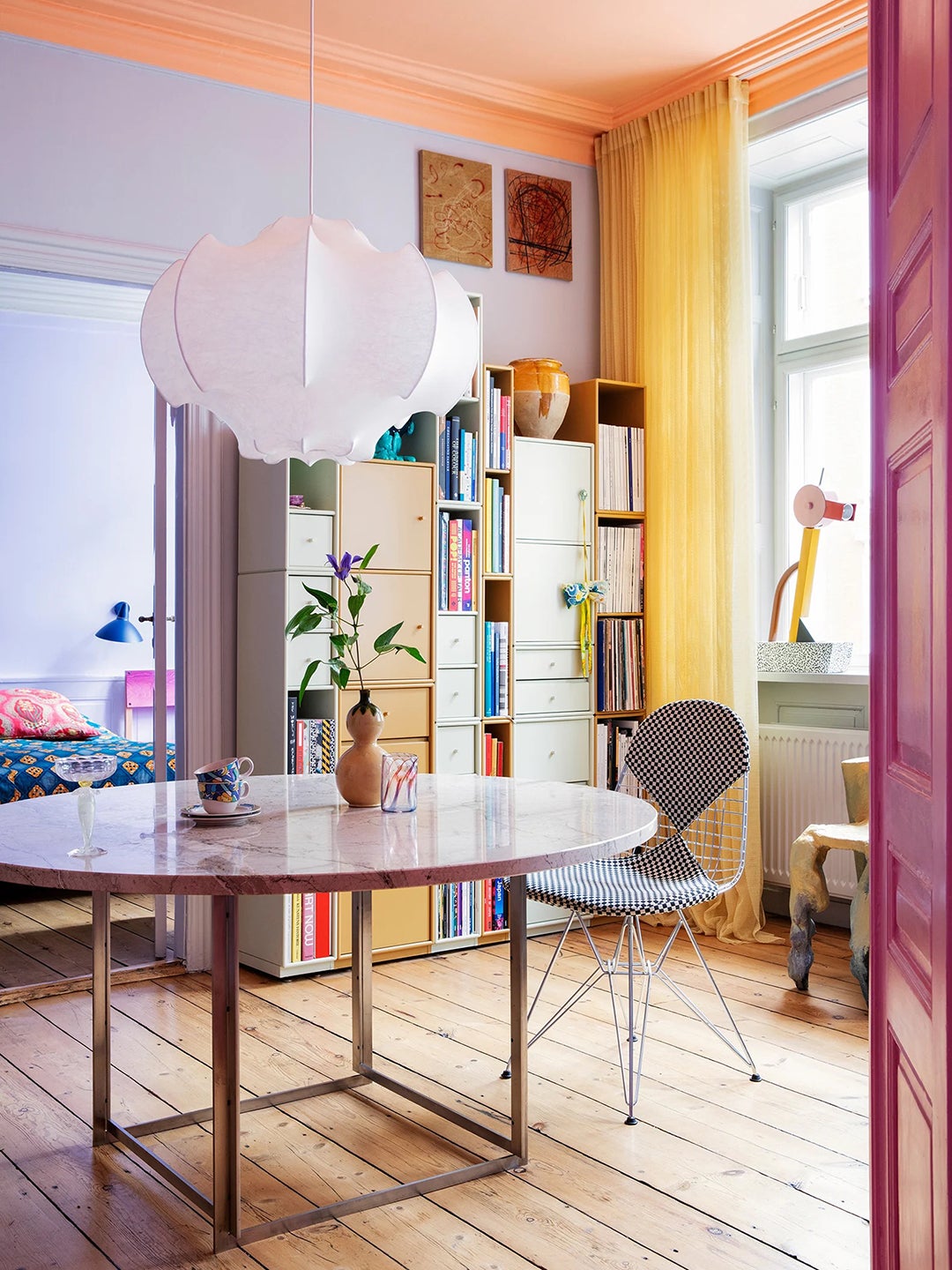
As a design editor, I started to wonder: Would following my cool summer palette at home make a difference there, too? “Integrating some of your colors—the ones that make you feel the best—into your personal space can feel even better [than doing it with clothing] because it’s a part of your energetic cycle,” Dobkine tells me over the phone a few weeks later. For example, she designed her dining room in her colors—winter, for the record—not just because it makes her look good, but because of the energetic feelings she gets when she’s in that room.
If you want to get superficial about it, you can, she says. For example, if a light purple shade is most flattering on you, painting a wall that color can make your skin look bright as you take a photo against it or even just lounge with a friend.
And while no one is telling you to go out and purchase a new sofa in your palette, one low-commitment way to work in new colors is with bedding. I immediately swapped my army green waffle duvet (because the only green in my palette is a deep teal) for an inky blue one I already had. Did I feel any different? Not immediately, but I did feel more at ease knowing I have a road map for future shopping purchases.
Now, when I shop IRL or online, I pull up my palette in my photos folder and hold it up to the item I’m considering. Does it match? Then I know it’ll go well in my home—and make me feel like I’m bringing it into a cohesive space. And that makes me feel calmer, happier, and alive. So it may be working after all.


