My True Feelings on Pantone’s Color of the Year After Staying in a Room Drenched in It
Does Peach Fuzz make everything peachy keen?
Published Feb 3, 2024 1:36 AM
We may earn revenue from the products available on this page and participate in affiliate programs.
As Domino dutifully reported in December, the color experts at Pantone named their 2024 color of the year Peach Fuzz, a warm, optimistic tone that feels like the first bite of the summer fruit.
That said, color of the year (or, in editor-speak, COTY) announcements are a funny thing, and these days, almost every single paint brand, from Benjamin Moore to Behr, decides on one. To poke fun at (or perhaps lean far into) the frenzy, in 2022 cool-kid paint brand Backdrop partnered with cool-kid shop Coming Soon on a macaroni and cheese shade they cheekily named Color of the Year. The description? “Yellow-orange rubber band.” As editors, we cover most of these announcements—but where does one draw the line between clever marketing and real-life application? It’s not as if we all repaint our walls every year to simply follow a trend.
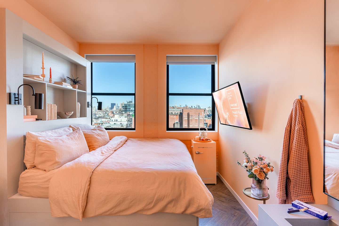
But Pantone’s selection also came with a promise: “Pantone 13-1023 Peach Fuzz captures our desire to nurture ourselves and others,” reads the company’s website. Nurture, ah. Even saying the word out loud is a bit soothing. And at the risk of sounding a little woo-woo, this month, nurturing was exactly what I was looking for: After three weeks of work travel and day 10 of a not-COVID cough, I checked in for a night at the Walker Hotel Tribeca, where an entire room is currently drenched in Patone’s Peach Fuzz. Would it cure me?
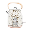
Upon walking into the room, I immediately noticed that there wasn’t an inch of space not devoted to the pinky orange color: The Bed Threads linen sheet set, the Ruggable rug on the floor, the Frigidaire mini fridge (stocked with on-hue beverages)—even the body wash smelled like sweet peach and nectar. And the walls? Color-matched to Pantone via Benjamin Moore.
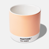
It’s easy to roll your eyes at such an obvious brand marketing moment. But wrapped up in a Happy Place waffle robe and sipping from a Pantone mug, it’s also just as easy to feel a sense of peace. When every aspect of a room is one color (rather than just an accent wall—shudder!), the space begins to feel like a warm hug. “I actually like all the peach,” said my artist husband. “It’s calming.” And he’s not wrong. After just a few hours in the space, I saw what Pantone meant: I felt nurtured.
I even slept better than I normally do in New York City hotel rooms, where traffic can be distracting and light always peeks through the blackout shades. Was it all the peach? Who can really say—I’ve yet to find a study that can prove its healing power—but it does signal to me that a well-designed room, in any color that speaks to you, might be all you need to feel nurtured, too.
