Why the Least Popular Bathroom Colors Are Still Ones You Should Use
These four striking spaces prove it.
Published Nov 16, 2023 1:55 PM
We may earn revenue from the products available on this page and participate in affiliate programs.
The color of your bathroom says a lot about how you want to feel when you’re in there. White enhances a sense of cleanliness. A zesty green says you want to be invigorated. And a cool blue? You probably like to end the day with a spalike soak. For these reasons, green, white, blue, and gray are the most popular color choices for bathrooms, according to the 2024 Bath Trends Report from the National Kitchen & Bath Association. The survey’s findings are based on feedback from 536 respondents who are members of NKBA, including designers, showroom dealers, manufacturers, contractors, and architects. We can’t say we’re all that surprised by the top shades: We’ve seen them work their calming magic time and time again.
So what hues aren’t making the cut? Apparently, brown, beige, black, metallics, orange/terracotta, and pink/peach are the least desirable colors for a bathroom. It’s true these options aren’t common, but that’s no reason not to embrace them. Here are four of our favorite examples of everyone else’s least favorite bathroom colors.
Brown
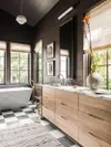
This bathroom is far from the seashell-filled scene you’d expect to see on South Carolina’s Sullivan’s Island. The chocolate-hued shiplap is a dramatic departure from standard stark white, but that’s not to say white isn’t necessary here. The crisp freestanding tub, marble vanity counter, and milky-hued pendant lamp keep the space from feeling cavernous.
Black
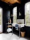
Like brown, black bathroom walls can be incredibly chic as long as you have other materials in the space to balance the darkness. In this Washington home, Lee Valley’s Lamp Black (in a wax finish) is evened out by hits of chrome with the vintage sink and RH towel cart.
Terracotta/Rust
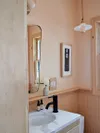
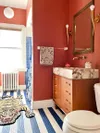
What happens when you take a popular color and a not so popular color and combine them? A whimsical, kid-friendly scene. On the walls, interior stylist and blogger Kate Pearce applied two coats of Farrow & Ball’s Book Room Red and, underfoot, Sherwin-Williams’s Porch and Floor Enamel in the color Commodore.
Peach/Pink
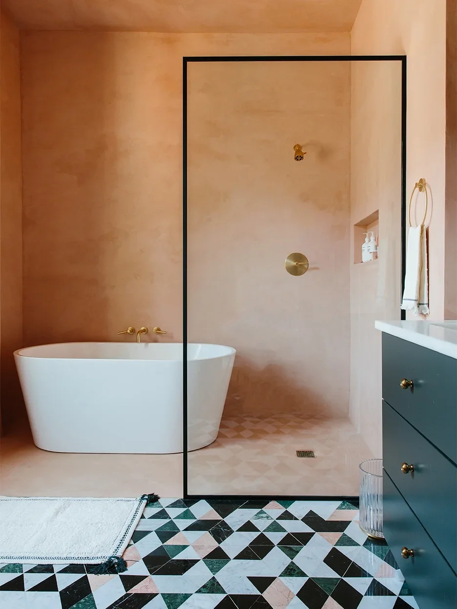
Sometimes changing the texture of paint can alter the way the color reads entirely. So if you’re on the fence about, say, peach, consider looking at limewash or waterproof tadelakt plaster treatments that you can carry into the shower.
